But Lighthouse says I'm accessible! · Part 2
We already saw that automatic tools are not enough to check the accessibility, now we're going to see what we can do to improve the a11y.
In the previous post we saw how to score 100 in accessibility in Lighthouse but still not having an accessible site. It's quite common to leave the a11y check for the end of the project, run some automatic tools, fix almost all the bugs they report and that's it.
But at this point you should know that's not enough, not even close to enough.
So... what can we do to improve accessibility? 🤔
Instead of developing a web and then checking for the accessibility, what if we try to be a little bit more empathetic with everyone and change the way we design and develop to take all of this into account from the very beginning?
And by everyone I mean EVERYONE, from the Client, to the Project Manager, the Designer, the Developers, the QA team, your friends, your family.
✅ Test before, during and after
Test as much as you can, run the automatic tools, take into account the manual checks and have a QA team if possible.
Wait, so even though we built the site thinking of accessibility, we need to test it as well?
Of course! We're not perfect, there will always be bugs, even if you don't intend to, and with a11y it's the same.
Usually we design, develop and test a site as usual, and in the end someone says "hey, maybe we should check the accessibility". What happens? There are a lot of a11y issues, and since it's at the end of the project, they're harder, and more expensive to fix, so not all of them will be fixed.
If we build a site thinking of a11y, and we test it all along, we'll be fixing the bugs during the design and development process, which is cheaper and faster. Although there might be some a11y bugs in the final check, there won't be a million!
For instance, now I'm using Vue, so it's component based, what we're doing is checking the a11y for each component, it makes it way easier.
✅ Go beyond the "100 Accessibility"
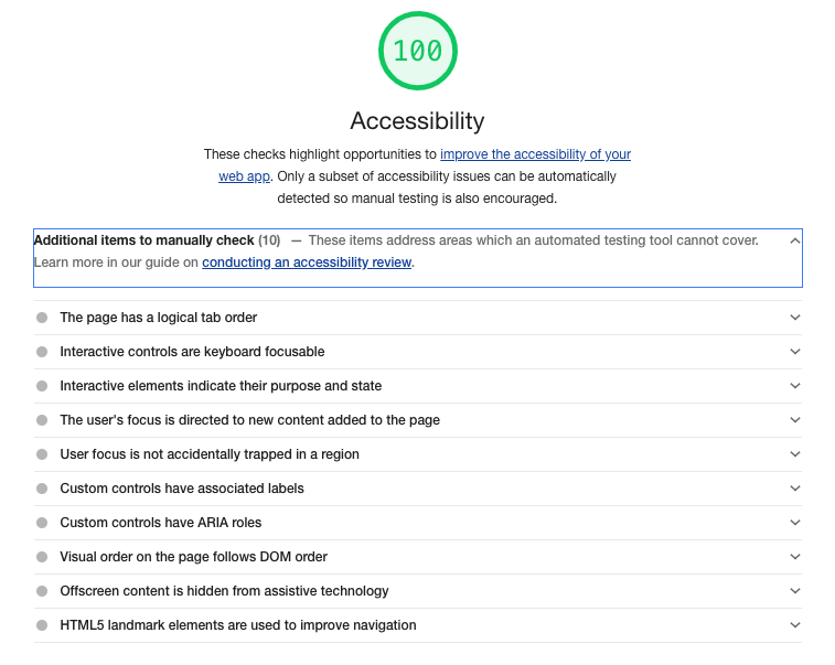
If we pay more attention to both Lighthouse and achecker, we'll notice they both provide more information about the accessibility.
In Lighthouse there's a list of items that should be manually checked. Although they don't mention anything about any of the accessibility bugs that I've listed above, they have a more detailed tutorial on how to perform these checks in the link they provide.
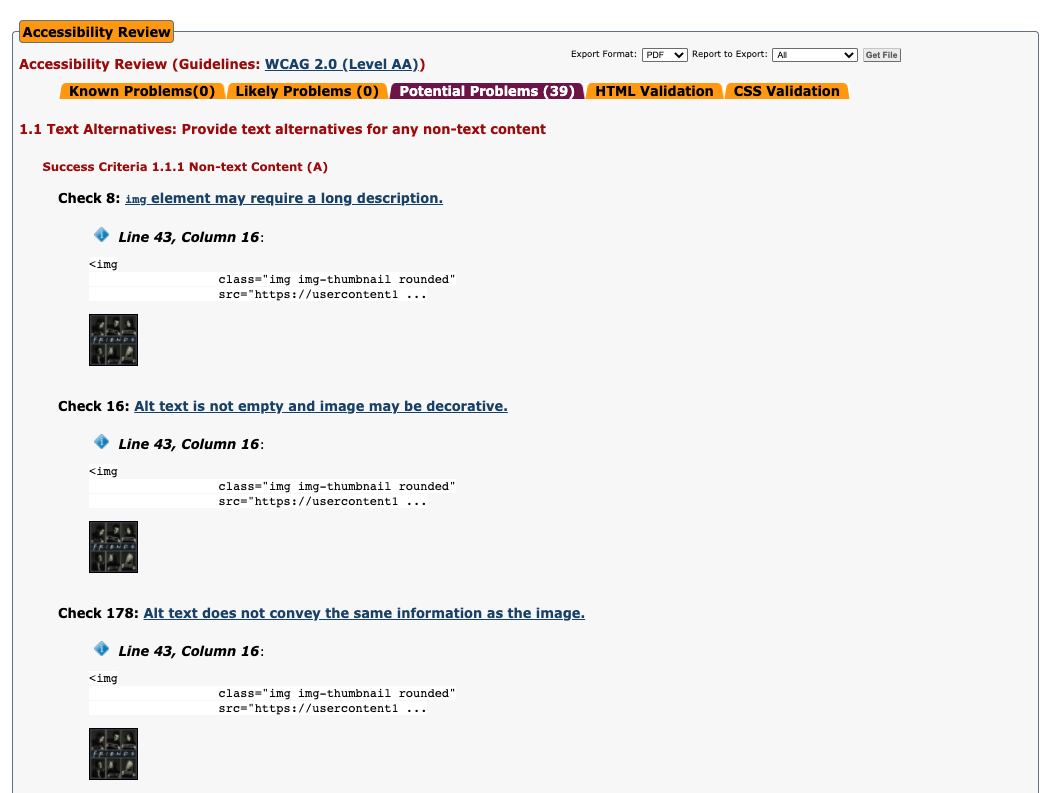
Something similar happens in achecker. Sure, by default they say "Congratulations! No known problems" but there are more tabs! If we go to the "Potential Problems (39)" tab we'll see that the very first potential issue they're talking about is one of our a11y bugs, the non-descriptive alt in the image:
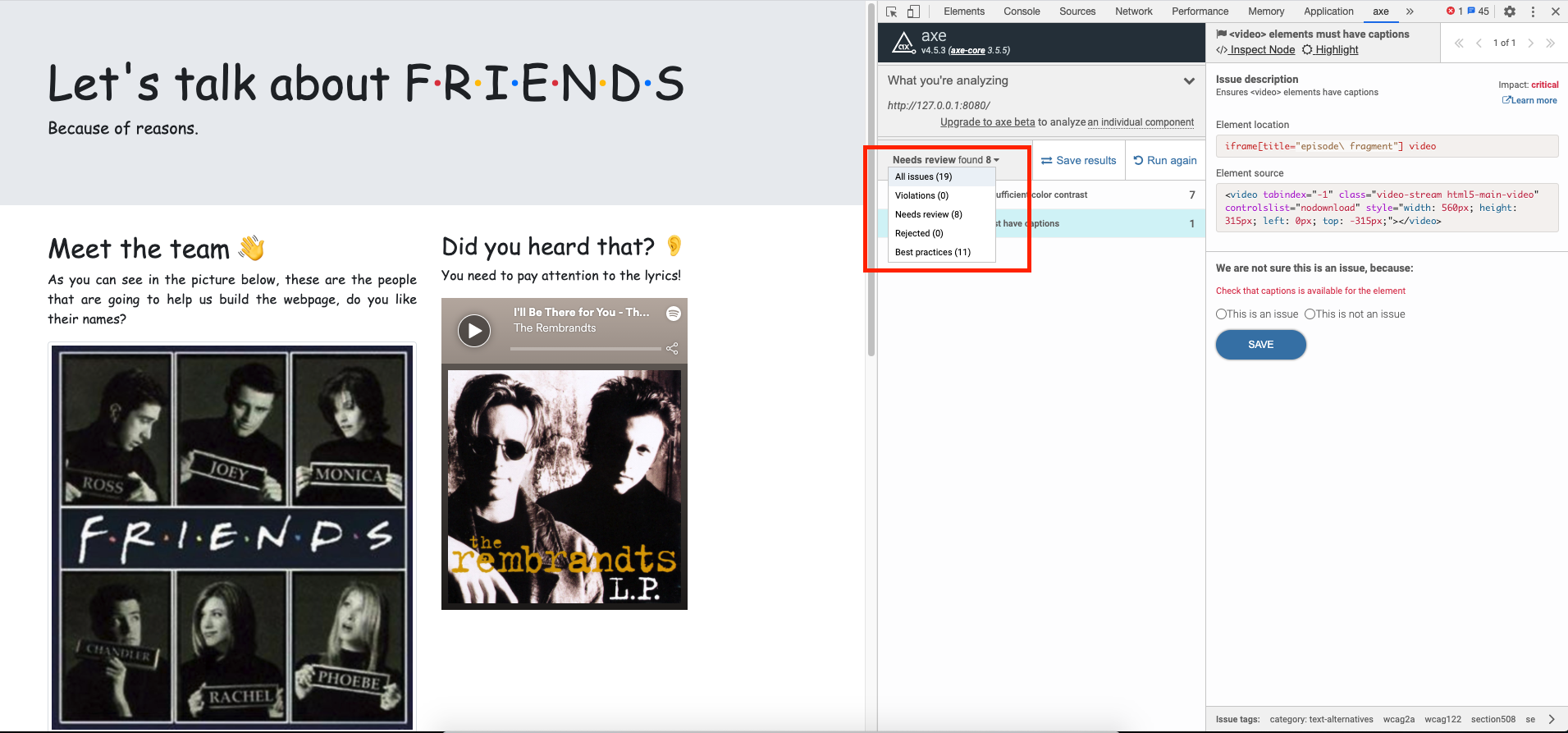
And there are other tools where we wouldn't have passed the automatic tests for the a11y, like the axe extension for Chrome, which is the one that we use at Codegram:
✅ And go beyond WGAG too
This is a quote from the book that I'm currently reading:
"people with dyslexia have a particular problem with reading justified aligned texts. It’s not clear where a line of text ends which makes it very easy to switch to the wrong line." — Better Web Typography for a Better Web, Matej Latin
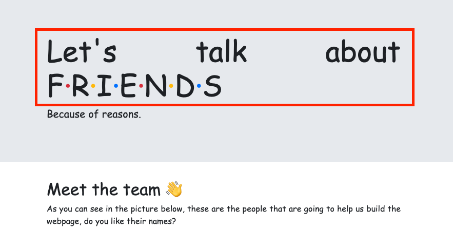
If we resize the screen a little bit, you'll see we're failing on that too in our sample (this is because of the CSS property we've set for the body text-align: justify;), and this time neither automatic tools nor WGAG have told us anything!
What I'm trying to say is that there are so many things to take into account, but do not feel overwhelmed. This is just like any other topic in this profession, that you might feel like there's a lot to learn, so just like you would do with any new cutting edge technology, learn about this.
Read, care and learn as much as you can, you will make mistakes, so will I, but we really need to care more about everyone. There are a lot of resources out there, now it's easier than ever to be an a11y superstar!
Plus, unlike the latest frontend framework, this is a safe bet, this won't be out of fashion ever!
✅ Follow people with special needs
I've always been aware of a11y, and then I cared even more after that month that I had to become an "expert", because during that time I realized how many accessibility issues needed to be taken into account and they aren't most of the time.
But what really helps me keep up with this topic is following people like Juanjo and Julian, blind software developers, who have to suffer all the non-accessible sites and apps.
Sometimes that's been more helpful than a thousand checklists and books.
✅ Last, but not least, A level is not an option
Try always to aim AA level at least (and remember there's more beyond WGAG!).
It will depend on the site, of course. It is not the same for a portfolio page than an official government site that every citizen will need to use eventually for some admin stuff.
You'd be surprised how many sites that should be accessible, aren't: from the famous Renfe web (the old one and the new one) to the new Radar COVID app, among many others like McDonald's and even Guardia Civil.
A final quote ✍️
Quoting w3.org for the third time (because there's always a third!), let's never forget this:
Web accessibility also benefits people without disabilities, for example:
- People using mobile phones, smart watches, smart TVs, and other devices with small screens, different input modes, etc.
- Older people with changing abilities due to ageing
- People with “temporary disabilities” such as a broken arm or lost glasses
- People with “situational limitations” such as in bright sunlight or in an environment where they cannot listen to audio
- People using a slow Internet connection, or who have limited or expensive bandwidth
As the www stands for (World Wide Web), we do live in a wide world with many different people who have many different needs. And again it is not my intention to scare you, it's just a fact that none of us is free from having a temporary or permanent need in the future, so let's try to make a more accessible web (and world) together, from people to people 💪🏻.
Just remember... "I'll be there for you, because you will be there for me too 🎵".
#FunFact 👻
I know what you're thinking, for real this time, I'm not talking about the form... "When is she going to talk about Comic Sans? Why the hell has she used that font?" Well, I just wanted to attract your hate attention.
I'm kidding, I just needed an excuse to tell you that Comic Sans is an accessible typeface!! Did you know that? If you don't believe me, you can read this article "The Reason Comic Sans Is a Public Good" and this other one "Designing for accessibility: The best defense for Comic Sans".
Resources 🌐
Here are some tools and interesting links (most of them I've already mentioned), and don't worry, this won't be my last post about this topic.
- Tools to check the accessibility:
- Lighthouse
- Axe (official page, chrome extension)
- Manual Contrast Checker (official page, chrome extension)
- Automatic Contrast Checker extension
- Learn more about accessibility:
- Another interesting links:
Cover photo by J. Kelly Brito on Unsplash