Raiders of the Lost Accessibility
Running audits on our site was the beginning to rediscover how much accessibility matters.
As you may know, a few weeks ago, we released our new Codegram website—with its shiny new animations, clear visual space, clean layout, iconic shapes to identify the different sections, and much more. We were so proud!
But as my colleague Núria pointed out in her post Improving a Gridsome website performance., it wasn't until someone thought of running an audit against the site that we faced reality:
Wow, what an unexpected uppercut! What's wrong with our accessibility?
Broadly speaking, when we say a site is accessible, we mean that the site's content is available and its functionality can be operated by literally anyone. Google Web Fundamentals
I thought that we had already covered the crucial aspects: a simple palette, clear focused elements, distinct sections, proper highlighted CTA, usable navigation and so on.
It turns out that I knew so little about accessibility! As a color-blind person, I'm a bit ashamed to admit that. I should be more aware of its importance, so let's dig it!
Let's raise those audits!
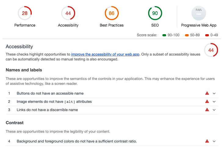
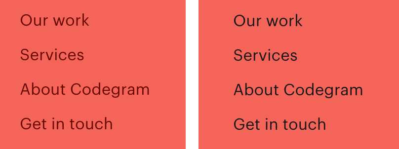
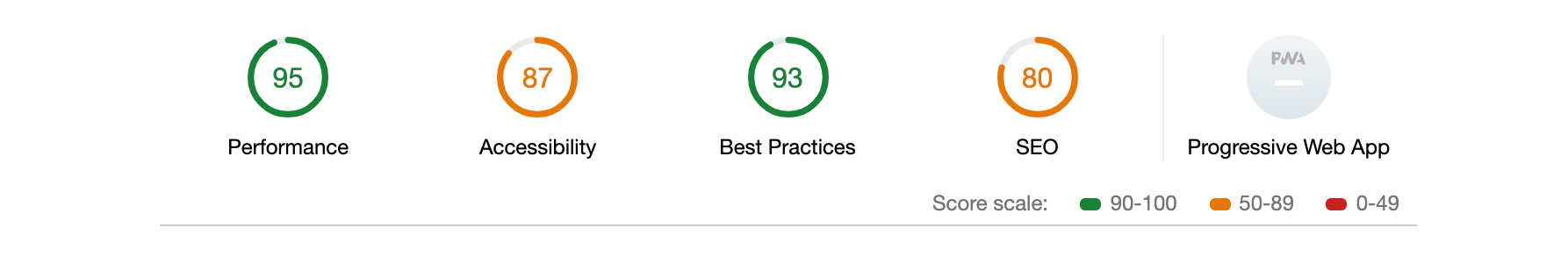
If we take a look at the audit checklist, we can see that our major issues are related to names and labels as well as contrast.
So at that point, any user with some level of vision impairment would have had trouble visiting our brand new site.
In order to fix that, first we added the respective aria-labels to all our buttons and links, so that a person with a screen reader will notice which element is focused.
Luckily, we were using a Button component that allowed us to get its label via props. We only needed to add this prop to fill our new aria-label, which makes all those buttons way more accessible.
    <template>
      <component
        :is="type"
        :href="href"
        :disabled="disabled"
        :to="to"
        class="btn"
        :aria-label="content"
      >
        <span class="btn__content">{{ content }}</span>
        <Arrow class="btn__arrow" />
      </component>
    </template>
On the other hand, all those links that are not under this component hood needed to be updated manually.
With those quick actions, we resolved half of the accessibility issues detected by the audit. And I thought the next one would be the easiest one: "Image elements do not have [alt] attributes".
Oh boy, was I wrong!
Technically it's quite a simple task: we just had to add an alt tag to images and g-images elements in our site. I started assigning all those tags, although I quickly noticed that something was off. I would hate this site if I was navigating it with a screen reader: what an unnecessary amount of tedious descriptions!
Then, I started wondering what would be the ideal length of an image description. What's relevant and what's not? I noticed that some images were just purely aesthetic, so should I label those?
All those doubts went away when I found the magnificent post 'Alt-texts: The Ultimate Guide' by Daniel Göransson.
After reading it a couple of times, I cherry-picked a collection of rules that I thought we should apply to our site:
- Understand the context where the image is placed.
- Be descriptive but concise; the user only needs relevant information.
- Do not indicate that it's an image; the screen readers will add that by default.
- End with a period, this will make screen readers pause a bit after the last word.
- Leave alt in blank if it doesn't have meaning for the reader, but don't remove it.
Once that was done, our accessibility skyrocketed. But hey, we're not finished here!
Fasten your seatbelts: we're heading to Contrast and Color Area.
When entering this zone, we need to ask ourselves a couple of questions: is our palette low-vision friendly? Are our combinations (color and texts) generating enough contrast for any kind of user that may visit our site?
To answer these, we used the Contrast Ratio tool developed by Lea Verou.
During this process, we came across a bunch of links that were too light to be over our brand color, so we modified them to get the AAA level.
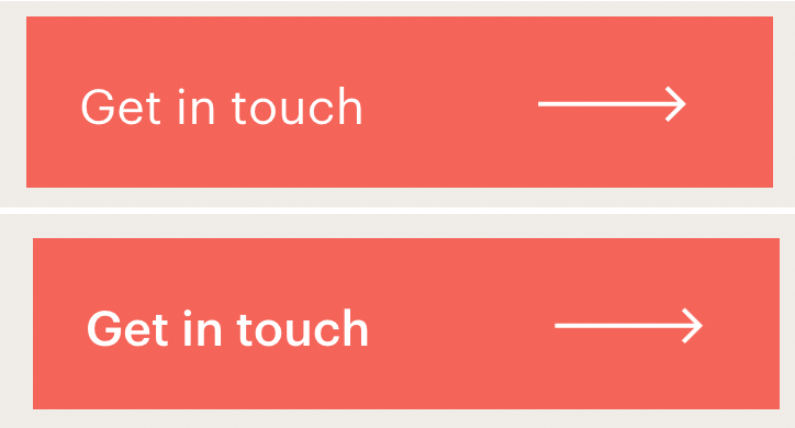
Also, we found out that some button fonts were too light to be readable for people with low vision, so we made them bold!
Those are all small changes, but the impact that they have in the usability of our website is huge.
It's been quite a journey, and we are more than happy with the results achieved.
This project opened my eyes to a new perspective on what the web ecosystem needs: more accessibility awareness.
One thing is clear: as a color-blind developer, my mission here it's not over. I'll be taking the Udacity course on Accessibility by Google and the Accessible UI patterns by Sara Soueidan workshop at Full Stack Fest!
Thanks for reading and I genuinely hope you'll join me on making the web better and more accessible for everyone!